AIR Tool | Maps and Interface
The AIR tool uses an innovative interface inspired by the State Climate Office’s Fire Weather Intelligence Portal, which itself was designed to put a wealth of information just a click away for forestry decision-makers and land managers.
Orienting yourself with the tool and its features can take some time, but this section of the user guide – along with the example that follows, plus a few minutes of free exploration in the tool – should help you understand how to use and harness the power of AIR.
Time Period-Based Tabs
Similar to your internet browser, which may have tabs to give you quick access to multiple websites, the AIR tool features tabs for three different time periods you may want to view:
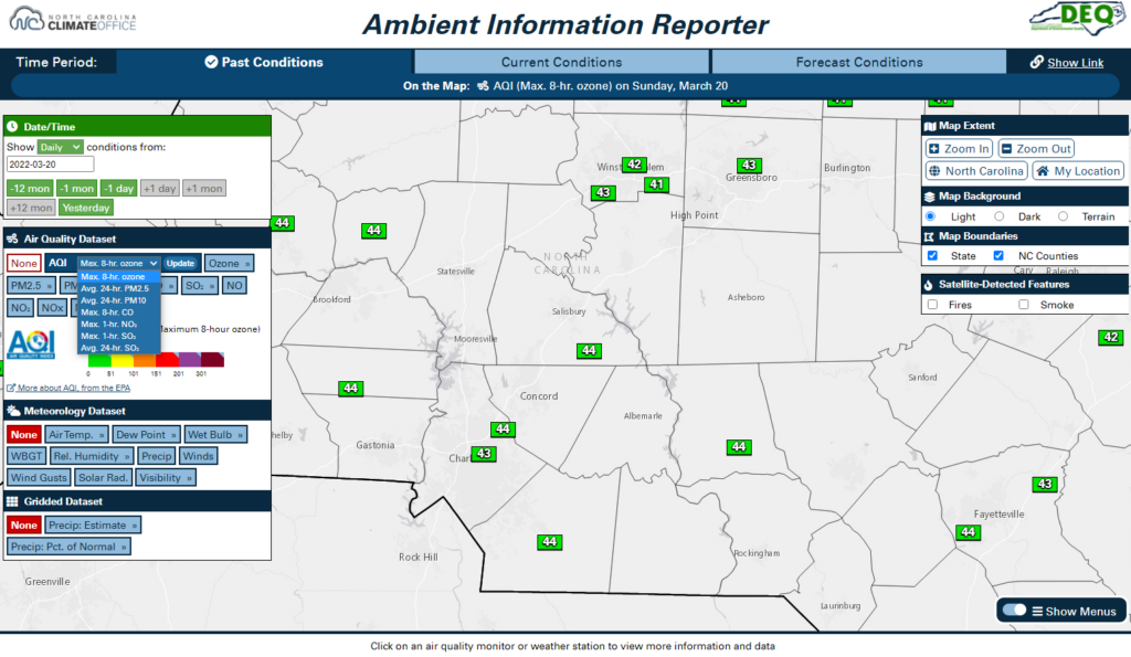
- Past Conditions, or what has happened on previous days, dating back to 2016
- Current Conditions, or what is happening now or in previous hours today
- Forecast Conditions, or what may happen in the next 3 to 5 days
The map location is preserved when switching tabs, so even if you’re displaying different datasets on each tab, you can easily view them all for the same area.
Bookmarkable Link
If you want to view the same datasets for the same geographic area every time you visit the AIR tool, you can use the bookmarkable link feature to copy a link to your current map view and options.
To access the bookmarkable link, click the “Show Link” button to the right of the time period-based tabs at the top of the page.
Date and Dataset Menus
On each tab, choose what to display on the map using the date and dataset menus, shown on the left side of the map (for the desktop site) or above the map (on the mobile site).
The date menu allows you to select the date and time for which observations are shown on the map. On the Past and Forecast Conditions tabs, you can also choose whether you want to view daily-aggregated datasets or hourly datasets. Changing this option will change the available datasets in the menus below.
On the desktop site, once you have selected a dataset, its legend will be displayed within the menu. To change the selected dataset, hover over the dataset menu to view all available parameters.
Some datasets also have multiple options available. For example, current PM2.5 data can be displayed as either the hourly concentration or the daily average as of the selected hour. For these datasets, all options will appear within a dropdown menu inside their button.
Map and Controls
As the primary place to view data, the map makes up the majority of the interface space. You can interact with this map as you would with any web-based map tools such as Google Maps. Click and drag to pan the map, double-click to zoom in, use your mouse scroll wheel or pinch your mobile device’s screen to zoom in or out.
Map navigation and layer options are also available in the menus on the right side of the map (on the desktop site) or beneath the map (on mobile devices). These include options for changing the Map Extent, such as zooming to your browser-detected location; the Map Background to a darker, lighter, or terrain shading; and the Map Boundaries, including state and county lines.
When using the desktop site, you can save a screenshot of the current map view by clicking the Take a Screenshot button in the bottom right corner. This will hide the page menus and show only the legends for the datasets shown on the map to give a cleaner image of the tool.
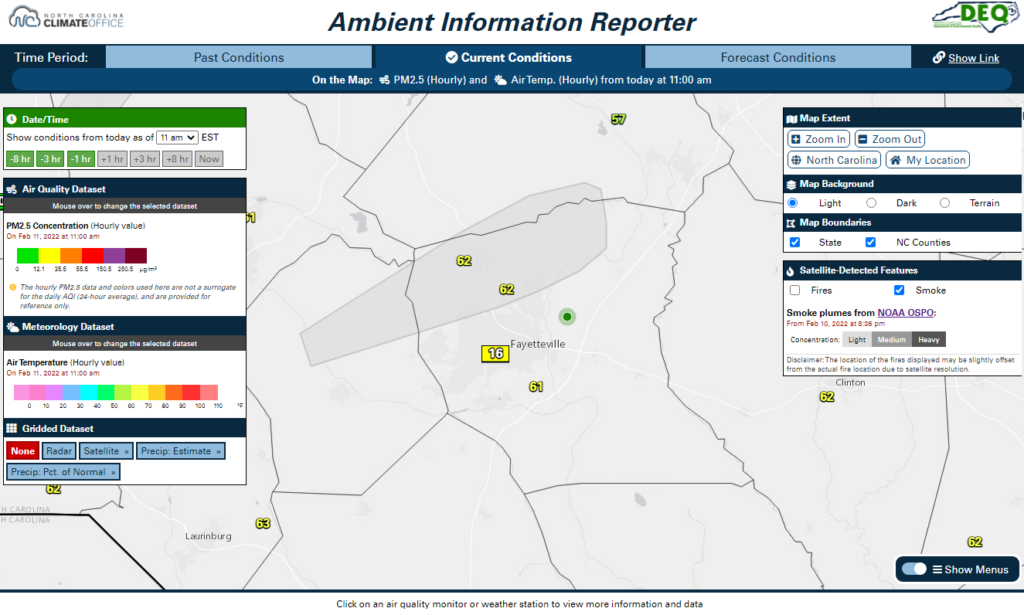
Satellite-Detected Features
Some poor air quality events have their roots with fires and smoke emissions, often originating outside of North Carolina. You can view satellite-detected fires and smoke plumes by turning on those layers in the Satellite-Detected Features menu.
This data originates from the NOAA Office of Satellite and Product Operations. It is updated routinely throughout the day, and more thoroughly each night to aggregate that day’s fires and smoke plumes. You can also click on a fire or plume to view more information, including when it was detected.
Mobile Layout
The AIR tool is designed to work with both larger-screen desktop and laptop computers along with smaller-screen tablets and smartphones. To accommodate this variety of devices, the AIR tool layout may appear differently depending on your device type and screen resolution.
On mobile devices, date and dataset menus appear above the map while legends and map options appear beneath the map. Dataset menus are also hidden by default, but they can be displayed by clicking the gold “Show dataset menus” banner. After changing the selected datasets, click the gold “Show the map” banner to view the data on the map.
Example: Sniffing Around the AIR Tool
After smelling smoke in the air, you decided to check out the AIR tool and see what conditions are like in your area, including what any nearby air quality monitors are showing.
First, in the Map Extent menu, you click the My Location button and allow your browser to detect your location. The map then zooms in to your county.
On the Current Conditions tab, the default datasets show the latest air temperatures and PM2.5 concentrations. Viewing this data, you note that there is one air quality monitor in your county and three nearby weather observing stations.
Turning on the satellite-detected smoke layer, you see that a plume was detected last night just north of your location. The closest air quality monitor is also reading slightly elevated PM2.5 levels, equivalent to the Code Yellow (Moderate) range, which helps explain the smoky smell you noticed.