AIR Tool | Station Data Plots
When viewing air quality or meteorology data on the map, you can click on any reporting site to view more information, including plots of recent data from that station or monitor.
Map Popups
After clicking on a site, a map popup will initially display showing more details about that location, along with a summary of reported conditions from the date or hour being viewed. Next to each parameter name is a “plot” link. Click that link to view one of the plots described below.
Hourly Data Plots
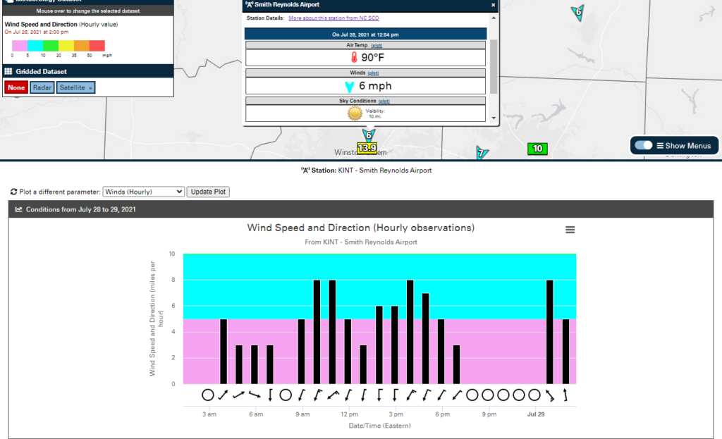
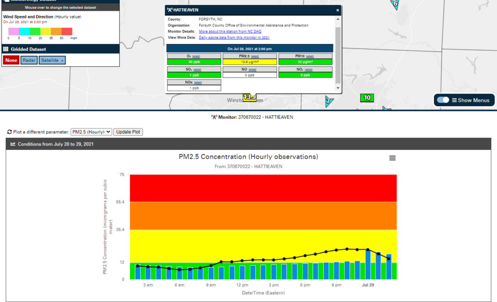
For hourly parameters, a plot will load beneath the map showing hourly data since midnight on the selected date. Hover over any of the hourly data points on this plot to view more information, including the observation time and the exact numerical value.
Some air quality parameters include blue bars on the hourly plots. For PM2.5 and PM10 data, these represent the daily average concentration ending at each hour. This can be important information since the Air Quality Index is based on the daily average.
Similarly, hourly ozone plots include blue bars representing the 8-hour average concentration ending at each hour, and the daily AQI is based on the maximum 8-hour average. Seeing spikes in hourly ozone concentrations, and a corresponding increase in the 8-hour average, can hint at what the daily AQI may be by referencing the color-coded plot background. Note that blue bars on ozone plots will not show up until after 8 am, and the 8-hour average values are considered preliminary until after 4 pm since the EPA’s daily averaging period begins at 8 am.
Almanac Charts
For the daily point-based parameters on the Past Conditions tab, a different sort of plot is accessible via the map popups. This almanac-type chart shows all recent daily values for the selected parameter in a table, organized by month and dating back to the beginning of the previous calendar year.
These charts can be an easy way to view observations at a glance, including days with higher or lower values, month-to-month variability, and for air quality parameters, the AQI values color-coded by their hazard range.
Example: Smoke in the Skies
Throughout the morning, you noticed smoke in the air, first in the northern sky before it moved overhead. Using the station plots in the AIR tool, you can investigate the hour-by-hour changes in winds that may have caused this hazy hazard, along with its impacts on the air quality.
In the menus, you select hourly PM2.5 concentrations and winds, then zoom in to your area. The closest weather station is showing northerly winds of 6 mph at the moment. After clicking on this station, you view its popup and click the “plot” link next to the Winds heading.
On the graph of hourly wind data that displays, you see that light winds shifted to northerly around 7 am, and increased in intensity between 9 am and noon.
Next selecting a nearby air quality monitor, you load its plot of PM2.5 data. That shows the steady rise in concentrations you noticed throughout the day, with the daily average value (represented by the blue bars) finishing the day in the Code Yellow range.