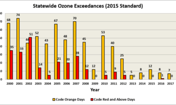
By Bradley McLamb, Elliot Tardif and Nick WitcraftThis post originally appeared on the State Climate Office’s Climate Blog in October 2018 as a guest post written by NC DAQ forecasters. Previously, we discussed the significant improvements... |Air Quality Blog
By Bradley McLamb, Elliot Tardif and Nick WitcraftThis post originally appeared on the State Climate Office’s Climate Blog in October 2018 as a guest post written by NC DAQ forecasters. North Carolina’s air quality has improved... |Air Quality Blog
By Bradley McLambThis post originally appeared on the State Climate Office’s Climate Blog in August 2014 as a guest post written by NC DAQ forecasters. For many locations in the Tar... |Air Quality Blog
By Bradley McLambThis post originally appeared on the State Climate Office’s Climate Blog in August 2014 as a guest post written by NC DAQ forecasters. Air pollution can...