This post originally appeared on the State Climate Office’s Climate Blog in October 2018 as a guest post written by NC DAQ forecasters.
Previously, we discussed the significant improvements in North Carolina’s air quality over the past ten years and how this has actually made air quality forecasting more challenging. So what goes into a forecast anyway, and how are we accounting for the changing nature of high ozone events?
In this post, we’ll share an in-depth, behind-the-scenes look at the considerations that go into our daily air quality forecasts, along with the oh-so-many ways that seemingly insignificant factors can result in dramatically different air quality even across a small area.
In our last blog series from 2014, we touched on the main large-scale atmospheric ingredients we look for when making our forecasts, including a stagnant air mass, sunny skies, hot or dry air, and light winds.
However, a number of smaller-scale features — both meteorological and those related to human activity — can result in much higher or lower ozone concentrations than the overall weather pattern might otherwise dictate.
Air Quality Forecasting Wild Cards
One weather feature that can make or break an air quality forecast is the presence or absence of clouds and precipitation. Ground-level ozone forms most abundantly during the daylight hours in the spring and summer when sunlight and warm weather are plentiful.
However, these conditions also give rise — quite literally, as warm air near the surface ascends — to clouds and precipitation. Plenty of favorable days for ozone production present a two-fold forecasting challenge. We must assess the likely extent and location of cloud, shower, and thunderstorm formation since that can keep ozone levels down. Areas that don’t have that pop-up activity can still see locally high ozone concentrations, so we must also predict where and how high those levels might be.
If there are more or less clouds and precipitation than we account for, or if our predicted placement is wrong, then our forecast can quickly go from hero to zero. Where most meteorologists’ problems end — getting the weather prediction correct — the air quality forecaster’s challenge has just begun!
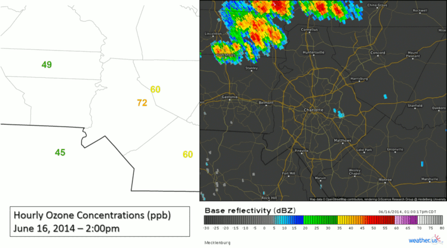
The icing on the cake is that our forecasts are for an 8-hour ozone average — specifically, the maximum 8-hour average within a 24-hour period. Even a single shower moving through can significantly reduce this average value, which means our forecasts must essentially be correct all day for us to accurately predict the air quality at a given location.
Even if we get everything correct with the meteorological analysis for a given day there is still one more complicating factor: human activity! If there happens to be an accident or gridlock on a major interstate, emission values could be significantly higher than expected in a localized area, which could cause higher ozone levels than we predicted.
As you can see, there is a daunting set of often unpredictable factors that determine the daily air quality concentrations, but we here at the NC Division of Air Quality enjoy the challenge of forecasting them, and we take enormous pride in the work that we do and the forecasting accuracy that we generally achieve.
Communicating and Grading the Air Quality Forecast
Of course, when we communicate our forecasts to the public, we can’t include nuances like “assuming no thunderstorms happen over your backyard” or “as long as I-40 doesn’t back up this afternoon.” Instead, we can only produce a single number and its associated Air Quality Index color code for a given location.
These codes — Green, Yellow, Orange, Red, and Purple — give folks a clear, concise message about what to expect the air quality to be like on a given day, while the numerical value corresponds to the expected maximum 8-hour average ozone concentration, which is the basis for the U.S. Environmental Protection Agency’s ozone standard.
While the AQI simplifies our forecast message regarding health impacts to the general public, assessing the accuracy of our forecasts based on AQI alone can be difficult or even misleading since ozone is measured in parts per billion (ppb), then converted to the AQI scale, which spans an increasingly higher range of values as the scale rises.
| Scale | Green | Yellow | Orange | Red | Purple |
|---|---|---|---|---|---|
| AQI | 0 – 50 | 51 – 100 | 101 – 150 | 151 – 200 | 201 – 300 |
| ppb | 0 – 54 | 55 – 70 | 71 – 85 | 86 – 105 | 106 – 200 |
As an example, if we predict a maximum 8-hour average ozone concentration of 71 ppb on a given day for the Charlotte region, that corresponds to an AQI of 101 or Code Orange. If the highest 8-hour average concentration measured by a monitor in that region is 67 ppb, our numerical forecast was pretty good — only 4 ppb away!
However, 67 ppb corresponds to an AQI of 90 (in the Code Yellow range), so if we were analyzing our forecasts based solely off of the AQI it would seem that we were off by 11 points and one color code! As you can see, while the AQI is a great way to communicate what our forecast means in terms of human health impacts over a forecast area, it’s not always the best grading system for air quality forecasts.
Likewise, it’s not appropriate to assess forecasted ozone concentrations the same way we might with maximum temperatures. The difference may not seem obvious, but there are a few reasons why we can’t — or shouldn’t — grade a forecasted ozone concentration of 71 ppb the same way we might grade a forecasted high temperature of 71°F.
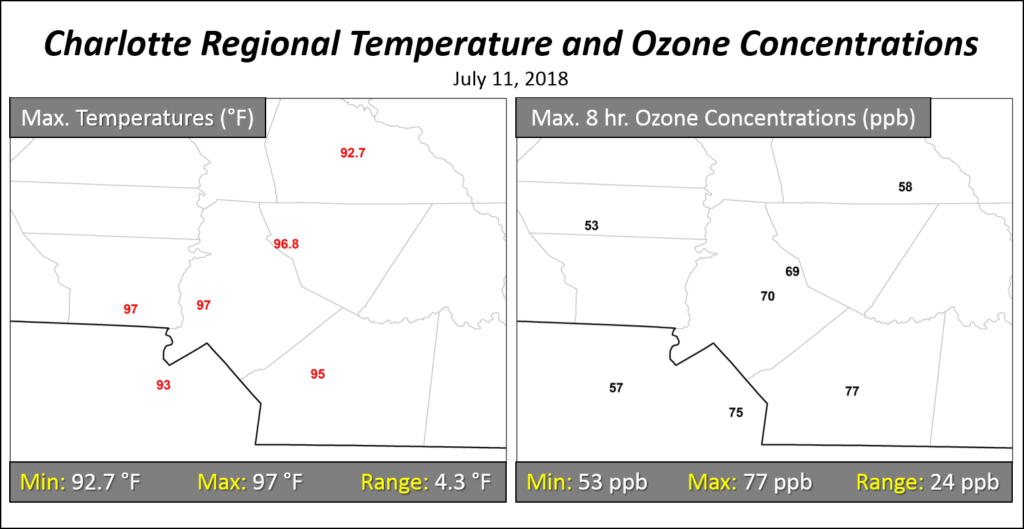
For one, temperature and ozone don’t behave the same way in the atmosphere. On most days, the temperature gradient across a region is fairly continuous unless interrupted by something like persistent cloud cover or a stalled frontal boundary.
By contrast, ozone concentrations can differ wildly even within a single county. On high ozone days, it’s not uncommon for downtown Charlotte to have ozone concentrations 20 to 30 ppb higher than locations just 20 to 30 miles away.
While we can detect some longer-term signs of human activity on temperatures, such as the urban heat island effect, ozone concentrations are much more sensitive to the daily contributions of anthropogenic emission sources such as cars and factories. That helps create large variability over small areas.
Also, remember that we’re forecasting the maximum 8-hour average ozone concentration over the course of the day, not an instantaneous value like the maximum temperature. Even on a day with clouds present, a break in the clouds for a few minutes may be enough for temperatures to spike to near the forecasted high. However, the amount and duration of the cloud cover over an 8-hour period can have a much greater effect on ozone concentrations.

While preparing and communicating the air quality forecast has become increasingly difficult due to the reduced spatial extent and overall number of high concentration days, we remain steadfastly committed to providing the citizens of North Carolina with the most honest, accurate, and professional daily air quality forecasts that we can.
In order to address the uncertainties of the daily air quality forecast, we write a daily forecast discussion that is publicly available. We are also working on making our forecasts less confusing by moving from regional-based forecasting to county-level forecasting. This change should be implemented over the winter and be in place before the start of the 2019 ozone season.
While our forecasts don’t always verify against the observed conditions and sometimes may appear to err on the side of caution — like in the example above, predicting a Code Orange day when the highest average from a nearby monitor only showed Code Yellow — we’re also aware that due to the many factors involved, local conditions and short-term ozone spikes can and do exceed what those monitors report.
We receive calls every year from folks who tell us how even one or two hours of elevated ozone affects them, which both emphasizes how important our job is as a public service and reminds us of the complexity within the air quality forecasting process.
To all of those who follow and rely on our forecasts, we say thank you! In the final part of this series, we’ll show a bit of science in action as we discuss more about air quality in North Carolina, including the very interesting (and, yes, challenging!) 2018 ozone season.