This multi-part blog series highlights several common sources of PM2.5 data with the intent not to endorse or dismiss any particular platform, but to suggest how to use these various tools together to assess your local air quality conditions, while recognizing their individual strengths and limitations. Find the other parts here: Part 1, Part 2, Part 3, Part 4.
Weather App (Breezometer)
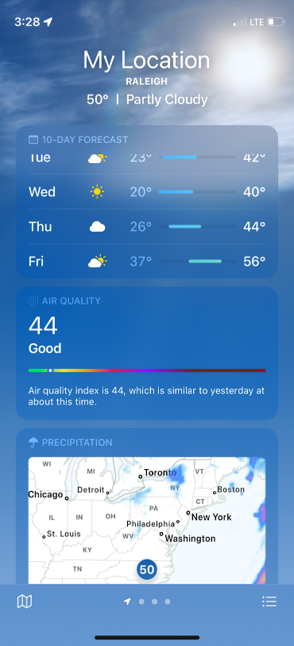
People using Apple products are almost certainly familiar with the Weather app, which comes by default on the Apple operating system. This app utilizes air quality data from Breezometer, a Google company.
Exactly how this air quality data is calculated is by far the most complicated, and also proprietary, of the data sources mentioned in this blog; it is essentially a black box algorithm fed by “real-time traffic data, official governmental sensors’ information, low-cost local sensors network, satellite data, weather forecast and meteorological information, reports on active fires, land cover, sophisticated algorithms, multiple models and machine-learning techniques” that outputs an AQI number. According to Breezometer’s website, “The end result is real-time air quality information accurate up to a resolution of 5 meters/16 feet.” There are a couple things to consider when using this data.
The AQI you see in this app is an ever-changing instantaneous estimation and cannot be extrapolated to a 24-hour period. Be wary of any statements by individuals or media that assess the entire day’s air quality using this app. Additionally, because there are so many inputs and the exact calculation methodology is proprietary, any number of inaccuracies in the assumptions of the models or machine-learning algorithms could result in a very different conclusion compared to measured concentrations.
The other thing to note is that Breezometer does not provide an AQI for each pollutant, but rather produces a hybrid output for all relevant pollutants. The AQI shown in the app also depends on which county the user is located within. For example, any user located in the U.S. will see a number on the EPA’s AQI scale, but it will represent the dominant pollutant, which could be fine particulates, ozone, or another pollutant. Breezometer has also created their own AQI scale, the “BAQI“, in which a value of zero represents poor air quality and 100 represents excellent air quality. This can be very confusing and is the opposite of the EPA’s AQI scale which is utilized by the majority of the air quality community, where lower values represent good air quality and higher values represent hazardous air quality.
Although this is arguably the most readily accessible data in terms of its ubiquitous presence on iPhones, iPads, etc., it also should be used only as a general reference to current conditions. It is a tool in the toolbox but use it with caution.
We do also want to point out here that when NCDAQ issues an Air Quality Action Day via the National Weather Service (NWS), you will see a notification within this Weather app at the top of the screen. The notification will link to the NWS alert text, which contains a link to NCDAQ’s Air Quality Portal. This is a great integration that helps us to disseminate more detailed information to the public.
Consider these Scenarios
Let’s revisit something we mentioned in the beginning of this blog series. Why would your phone’s Weather app say your local Air Quality Index is Code Red when we, the North Carolina Division of Air Quality (NCDAQ), have only issued a Code Orange Alert?
In this scenario, Breezometer’s algorithm is expecting the real-time air quality at your exact location to be Code Red, based on a number of different variables and inputs. This may be accurate and you can take action to protect your health. EPA’s review of health studies on fine particulate matter have, however, resulted in a 24-hour short-term exposure standard. In other words, the standards are based on the health effects that someone might experience with 24 hours of PM2.5 exposure. Let’s say that on this particular day, NCDAQ forecasters know that a cold front will sweep through in the afternoon and lower the 24-hour PM2.5 average to Code Orange in your county, hence the lower alert category. This type of scenario is a common reason that your short-term air quality data may appear higher than the daily forecast.
Alternatively, you may notice the opposite situation. In this scenario, let’s say your PurpleAir monitor reads Code Green early in the morning. But, you open your Weather app and see a special NWS message with a Code Orange Air Quality Alert from NCDAQ. You want more information, so you go to the forecast discussion and learn that there is an active wildfire in your county, just to the north of your city. Over the next few hours, the winds will shift in such a way that the smoke will inundate your location, and the 24-hour PM2.5 average is expected to net out in the Code Orange range. This type of scenario is a common reason that your short-term air quality data may appear lower than the daily forecast.
There are any number of scenarios like this that may account for the discrepancies that you see in your air quality resources.
Summary of Data Sources for PM2.5 in North Carolina
NCDAQ is your source for official, vetted air quality data each hour of the day. The NCDAQ forecast will give you an idea of what the air quality will be in the next three days, and is produced by professional meteorologists with years of experience who can take into account multiple factors like current observations, meteorology, and location-specific characteristics and pollution trends.
However, the NCDAQ monitoring network may not cover your specific area, and/or you may want to know what your air quality is at a more precise moment in time. In that case, you can supplement the official data with low-cost sensor data, like PurpleAir. This information also represents real measured observations but keep in mind that it has not gone through a rigorous quality assurance process and the raw sensor data tends to bias higher than reality.
Next, you can take a look at the Fire and Smoke map, AirNow or your Weather app, but keep in mind here that these numbers are largely based on algorithms and machine learning, and do not represent actual measured concentrations but instead a statistical “best-guess” at air quality conditions.
The ultimate goal of all these air quality resources is to protect public health but because of the differences in how pollution is measured or calculated and displayed, it can be hard to understand the information at hand. Hopefully this has helped to clarify 1) why you might see conflicting information at any given time and 2) how to use these resources together to make decisions for you and your family.
We still hope that for North Carolina air quality data and forecasts you will rely first and foremost on the Air Quality Portal and the robust, high quality data available through it, but we do understand the need for additional information during air quality events and when conditions are changing rapidly.
The following table summarizes the strengths and limitations of all the data sources discussed in this blog series.
| PM2.5 DATA SOURCE | How is data collected or produced? | Time Scale(s) | Units of Measurement | STRENGTHS | LIMITATIONS |
| NCDAQ Forecast and Discussion | Produced daily by a team of experienced meteorologists | 24-hour average (midnight to midnight) | U.S. EPA AQI (“Air Quality Index”) | Takes into account all available data including but not limited to current observations and trends, satellite imagery, meteorological and photochemical models, etc. to craft the best-possible forecast Detailed information and descriptions of current and future air quality conditions written by real people 365 days a year | County-level spatial coverage AQI forecast is daily, not “real-time” |
| NCDAQ Data | Measured on regulatory monitors | Hourly average or current daily average for concentration data 24-hour average value for AQI data | µg/m3 (“micrograms per cubic meter”) for current or past days U.S. EPA AQI for past days | Monitors are installed, calibrated, maintained and audited by a dedicated team of NCDAQ staff Measures using filter media, the most accurate method Data goes through rigorous quality assurance processes AIR Tool displays fires and smoke plumes in addition to measurements AIR Tool displays the official AQI number used in regulatory reporting | Limited spatial coverage of monitoring stations Cost prohibitive Data is not “real-time” |
| PurpleAir | Measured on low-cost sensors | Real-time 10-min 30-min 1-hour 6-hour 1-day 1-week 1-month 1-year | U.S. EPA AQI or µg/m3, depending on what is selected | Wide spatial coverage “Real-time” data is refreshed every 2 minutes Can apply a conversion factor to account for sensor biases | Uses a laser to count particles, which are less accurate and typically read higher than regulatory monitors Can be installed incorrectly or located improperly Unknown calibration and maintenance history |
| AirNow/ NowCast | Algorithm uses observations and statistics | Hourly average | NowCast AQI | Attempts to relay AQI information to the public for air pollution events happening on shorter-than-24-hour timeframes | Statistical projection of the day’s 24-hour AQI Only accounts for past air quality Data is not “real-time” |
| AirNow’s Fire and Smoke Map | Algorithm uses observations and statistics | Hourly average | NowCast AQI | Shows NCDAQ monitors (“Permanent/Temporary Monitors”) and PurpleAir monitors (“Low-Cost Sensors”) in the same map together for high spatial coverage Also displays fires and smoke plumes, short-term trends, and actions you can take to protect your health Correction factor applied for PurpleAir’s tendency to bias high Smoke Outlooks include detailed information and forecasts for areas of concern | NowCast AQI is displayed instead of measured concentrations; monitor/sensor concentration data is difficult to find Smoke Outlook forecasts may or may not match NCDAQ forecasts (potential for conflicting info) Data is not “real-time” |
| Apple’s Weather App (via BreezoMeter) | Algorithm uses observations, models and machine-learning | Real-time | U.S. EPA AQI | Can give you a general rating of air pollution for your location in real-time | Proprietary algorithm, the exact details of which are not publicly available Shows dominant pollutant; no way to select a specific pollutant |