This multi-part blog series highlights several common sources of PM2.5 data with the intent not to endorse or dismiss any particular platform, but to suggest how to use these various tools together to assess your local air quality conditions, while recognizing their individual strengths and limitations. Find the other parts here: Part 1, Part 2, Part 3.
AirNow’s Fire and Smoke Map
The Fire and Smoke Map is another EPA product, which was developed in collaboration with the U.S. Forest Service. This is another useful way to view current fires, smoke plumes, and PM2.5 AQI data all on one map – which NCDAQ’s AIR tool does with raw hourly data. The Fire and Smoke map displays this data slightly differently, which we discuss below. Also keep in mind that a new version of the Fire and Smoke Map is scheduled to be released this year, so some of these features may soon look different.
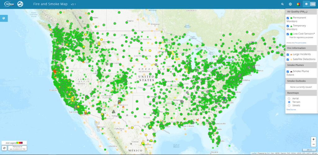
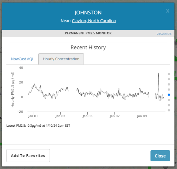
First, three types of monitors are displayed here together: permanent monitors operated by air agencies, temporary monitors operated by air agencies during fire/smoke events, and low-cost sensors from PurpleAir. All the measured data has been converted to and displayed as the NowCast AQI and as we discussed in our previous blog, the number and color you see on this map is a projection of the day’s 24-hour average AQI using a statistical equation which depends on how stable the air quality has been in the past. You can find the actual hourly measurements on the Fire and Smoke Map, but you need to click on the monitor and go to the Hourly Concentration tab (see the screenshot below).
Secondly, remember when we mentioned in Part 2 of this series how PurpleAir monitors tend to overestimate the actual value of PM2.5? For the Fire and Smoke Map, the EPA applies a correction factor to the PurpleAir data so that it’s more comparable to the agency data collected from permanent/temporary monitors. You can find a lot more information about this here on EPA’s Q&A document, but in a nutshell the equation corrects for the known biases of these sensors and allows both data sources to be viewed together more cohesively. Additionally, the PurpleAir data is averaged to hourly data before appearing on the Fire and Smoke Map.
Another feature of the Fire and Smoke map is Smoke Outlooks for specific wildfires or areas of concern. These outlooks come from a nationally deployed team of Air Resource Advisors via the Interagency Wildland Fire Air Quality Response Program (IWFAQRP). You can find information about this program here.
One potential point of confusion here is that a forecast is included with these outlooks, which may differ from NCDAQ’s forecast. The IWFAQRP team has the flexibility to forecast for various averaging times during the day (for example: a separate morning, afternoon and evening forecast), while NCDAQ forecasters must adhere to the EPA’s PM2.5 standard which covers an entire 24-hour period. Keep in mind, the IWFAQRP forecasts only exist for specific areas when an active wildfire is burning whereas NCDAQ forecasts are published every day for every county.
The table below is a summary comparing NCDAQ’s data with the Fire and Smoke Map. Next up, Part 5 of this blog series will discuss Apple’s Weather App in detail and summarize everything we’ve covered thus far.
| PM2.5 DATA SOURCE | How is data collected or produced? | Time Scale(s) | Units of Measurement | STRENGTHS | LIMITATIONS |
| NCDAQ Forecast and Discussion | Produced daily by a team of experienced meteorologists | 24-hour average (midnight to midnight) | U.S. EPA AQI (“Air Quality Index”) | Takes into account all available data including but not limited to current observations and trends, satellite imagery, meteorological and photochemical models, etc. to craft the best-possible forecast Detailed information and descriptions of current and future air quality conditions written by real people 365 days a year | County-level spatial coverageAQI forecast is daily, not “real-time” |
| NCDAQ Data | Measured on regulatory monitors | Hourly average or current daily average for concentration data 24-hour average value for AQI data | µg/m3 (“micrograms per cubic meter”) for current or past days U.S. EPA AQI for past days | Monitors are installed, calibrated, maintained and audited by a dedicated team of NCDAQ staff Measures using filters, the most accurate method Data goes through rigorous quality assurance processes AIR Tool displays fires and smoke plumes in addition to measurements AIR Tool displays the official AQI number used in regulatory reporting | Limited spatial coverage of monitoring stations Cost prohibitive Data is not “real-time” |
| AirNow’s Fire and Smoke Map | Algorithm uses observations and statistics | Hourly average | NowCast AQI | Shows NCDAQ monitors (“Permanent/Temporary Monitors”) and PurpleAir monitors (“Low-Cost Sensors”) in the same map together for high spatial coverage Also displays fires and smoke plumes, short-term trends, and actions you can take to protect your health Correction factor applied for PurpleAir’s tendency to bias high Smoke Outlooks include detailed information and forecasts for areas of concern | NowCast AQI is displayed instead of measured concentrations; monitor/sensor concentration data is difficult to find Smoke Outlook forecasts may or may not match NCDAQ forecasts (potential for conflicting info) Data is not “real-time” |