This multi-part blog series highlights several common sources of PM2.5 data with the intent not to endorse or dismiss any particular platform, but to suggest how to use these various tools together to assess your local air quality conditions, while recognizing their individual strengths and limitations. Find the other parts here: Part 1, Part 2.
AirNow / NowCast
AirNow is an EPA platform that utilizes something called the NowCast AQI, which was “designed to be responsive to rapidly changing air quality conditions, such as during a wildfire.” The NowCast is a statistical model that uses an algorithm to predict what the 24-hour average PM2.5 AQI will be for that location based on the volatility of the past 12 hours of air quality. Also important to note here is that the AirNow gauge will display the dominant pollution, i.e., the pollutant with the highest concentration at that hour, which is not always necessarily PM2.5.
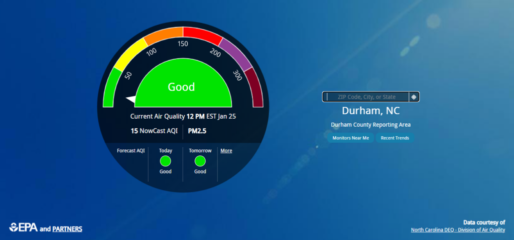
According to the available technical information, “The NowCast calculation uses longer averages during periods of stable air quality and shorter averages when air quality is changing rapidly. The NowCast allows AirNow’s current conditions to align more closely with what people are actually seeing or experiencing.” This is an attempt to relay information to the public in a more timely manner when air pollution events are happening at shorter than 24-hour time frames.
This has historically been a point of confusion for the public as it will often be at odds with NCDAQ’s data and forecast. Imagine, for example, a location has experienced very low particle pollution for several hours prior to some kind of air quality event (a wildfire, for example). At that point in time right before the event, the NowCast AQI predicts Code Green conditions for the day. However, the algorithm does not take into account that the future event is expected to significantly worsen the air quality for the next 12 hours of the day. NCDAQ forecasters, however, can utilize their expertise in meteorological analysis and forecasting when predicting the 24-hour average for the day; therefore, they’ve issued a Code Orange Air Quality Action Day for that county.
The graph below illustrates this concept using a real example from June 8, 2023. NCDAQ meteorologists forecast an AQI of 130 (equivalent to 47.2 µg/m3, or the green line below) for the day for Wake County, which means a Code Orange Air Quality Action Day was declared. This decision was made despite raw observations (a.k.a. the hourly measured values) being in the Code Yellow range throughout much of the morning hours, depicted by the black line below. The forecasters anticipated that smoke high in the atmosphere would mix down to the surface in the afternoon hours, and the public’s 24-hour particle pollution exposure would actually equate to Code Orange conditions. Remember, the EPA’s basis for the PM2.5 standard is based on health effects over an entire 24-hour period.
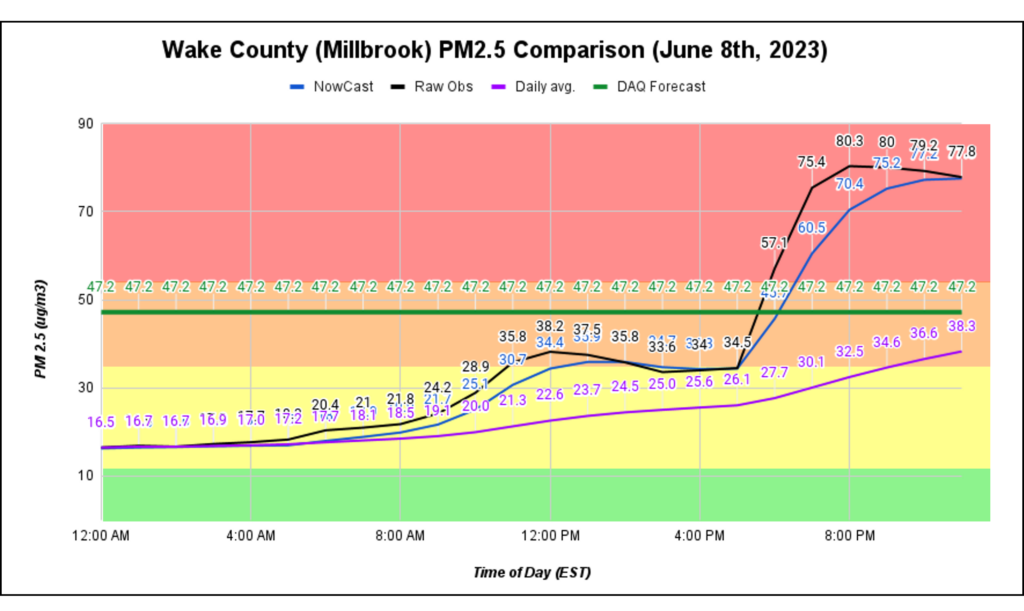
You can see this trend within the purple line above, which depicts how the cumulative daily average crept up throughout the day, eventually reaching 38.3 µg/m3 in the Code Orange range as predicted, albeit slightly below the forecasted AQI (the green line). As a side note: the data presented in the graph is for one monitor within Wake County; it’s possible that the daily PM2.5 average could have been higher somewhere else in the county.
What we want to emphasize is how the NowCast algorithm (the blue line) attempts to predict the daily average (the purple line), but in reality closely mimics NCDAQ’s raw observations (the black line) with a slight temporal delay. We hope that this example helps to clarify why the NowCast value that you may see on your phone or on the news will not perfectly match that which is provided by NCDAQ.
The table below is a summary comparing NCDAQ’s data with NowCast. Next up, Part 4 of this blog series will discuss the EPA’s Fire and Smoke map in detail.
| PM2.5 DATA SOURCE | How is data collected or produced? | Time Scale(s) | Units of Measurement | STRENGTHS | LIMITATIONS |
| NCDAQ Forecast and Discussion | Produced daily by a team of experienced meteorologists | 24-hour average (midnight to midnight) | U.S. EPA AQI (“Air Quality Index”) | Takes into account all available data including but not limited to current observations and trends, satellite imagery, meteorological and photochemical models, etc. to craft the best-possible forecast Detailed information and descriptions of current and future air quality conditions written by real people 365 days a year | County-level spatial coverage AQI forecast is daily, not “real-time” |
| NCDAQ Data | Measured on regulatory monitors | Hourly average or current daily average for concentration data 24-hour average value for AQI data | µg/m3 (“micrograms per cubic meter”) for current or past days U.S. EPA AQI for past days | Monitors are installed, calibrated, maintained and audited by a dedicated team of NCDAQ staff Measures using filter media, the most accurate method Data goes through rigorous quality assurance processes AIR Tool displays fires and smoke plumes in addition to measurements AIR Tool displays the official AQI number used in regulatory reporting | Limited spatial coverage of monitoring stations Cost prohibitive Data is not “real-time” |
| AirNow/ NowCast | Algorithm uses observations and statistics | Hourly average | NowCast AQI | Attempts to relay AQI information to the public for air pollution events happening on shorter-than-24-hour timeframes | Statistical projection of the day’s 24-hour AQI Only accounts for past air quality Data is not “real-time” |