In 2023, an incredible 45 million acres (18.5m hectares) of forest burned in Canada. And last summer in particular, when the large-scale weather pattern was just right (just… wrong?) smoke from these wildfires poured into the U.S. during multiple distinct days-long events. Within this time period, the U.S. saw some of the worst air quality in recent years in terms of particle pollution, otherwise known as fine particulate matter or PM2.5. Wildfire smoke is loaded with PM2.5 in the form of combustion materials, organic compounds, soot, and metals.
With air quality having been affected on such a massive scale across the continent, more and more public eyes were (and are) on local air quality conditions and forecasts, and people want to know how their day and their health will be impacted. This increase in awareness has highlighted the fact that there are several sources of air quality data available, and those sources often display different numbers and color categories. This is confusing, potentially misleading, and at worst leaves people with conflicting messaging on how to protect their health.
So what’s going on? For example, why would your phone’s Weather app say your local Air Quality Index is Code Red when we, the North Carolina Division of Air Quality (NCDAQ), have only issued a Code Orange Alert?
Essentially, air quality data for a specific time and place can vary because of the method or equipment used to collect it and the time scale or units of measurement for which it’s calculated or displayed. These are not consistent across platforms, and when conditions at a location are changing quickly or when particle pollution levels are oscillating near a threshold, the numbers you see from various websites or apps can look significantly different. This multi-part blog series will highlight several common sources of PM2.5 data with the intent not to endorse or dismiss any particular platform, but to suggest how to use these various tools together to assess your local air quality conditions, while recognizing their individual strengths and limitations.
The Air Quality Index (AQI)
Before getting into it, let’s talk briefly about the AQI, which is the official U.S. EPA Air Quality Index. This color-coded scale categorizes the air quality (good to hazardous) and describes the groups of people whose health may be affected within that category.
There is an AQI for five major pollutants (ozone, particulate matter, carbon monoxide, nitrogen dioxide, and sulfur dioxide) and the quantitative breakpoints for each AQI color category incorporate the National Ambient Air Quality Standards (NAAQS) that are set for each pollutant. The NAAQS are set based on many factors including epidemiological, toxicological and exposure studies and cover varying time frames. For example, the ozone NAAQS uses an 8-hour average whereas the short-term PM2.5 NAAQS uses a 24-hour average
The PM2.5 AQI therefore represents a 24-hour average of PM2.5 concentrations in micrograms per cubic meter (µg/m3) measured at each hour of the day. In other words, the PM2.5 AQI is one single daily (midnight to midnight) number used to communicate potential health impacts from particle pollution to the public if they were to be exposed for 24 hours straight. We mention this to emphasize that anytime you see an “instantaneous” PM2.5 AQI or anything using less than a 24-hour average, it is an unofficial number that does not follow EPA’s methodology and is not used in regulatory reporting or decision-making.
NCDAQ Data and Forecasts
First, let’s talk about NCDAQ’s data and forecasts, since we are the team that issues Air Quality Action Days (also sometimes called Air Quality Alerts) for North Carolina that you see shared via our partners at the National Weather Service, the media and through other sources such as Apple’s Weather app.
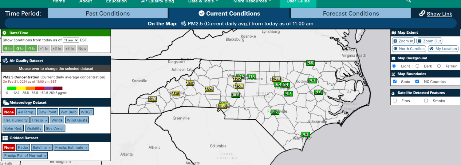
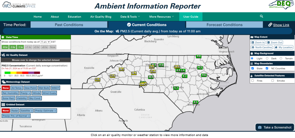
NCDAQ provides raw hourly PM2.5 concentration data in µg/m3 using a network of EPA-approved monitoring sites across the state; this is the data you can find on our AIR Tool at about 10 minutes past every hour. You can also view the current daily (24-hour) average concentration, which is a cumulative average of all the hours up to that point in the day. The agency’s permanent regulatory monitors are placed in areas according to specific EPA requirements. They’re operated and maintained by a dedicated team of NCDAQ staff, and the measurements go through constant and rigorous quality assurance checks. The data that NCDAQ collects is critical to show that North Carolina is complying with the NAAQS and is used in policy decision-making.
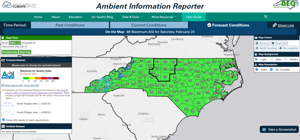
NCDAQ’s team of air quality meteorologists issue forecasts on a county level and discussions every day for the next three days out. Because we, as a state government, function as an extension of the federal government (i.e., the EPA) and the EPA’s short-term National Ambient Air Quality Standard for PM2.5 is currently a 24-hour average, we are required to put forth one single AQI number for each day per county. This means that we take into account what the air quality will be from midnight to midnight that day, and use our best judgment as to what the 24-hour average value will be. We issue Air Quality Action Days when the 24-hour average PM2.5 concentration is expected to be in the Code Orange range or above. NCDAQ forecasts for 91 of North Carolina’s 100 counties, and our partners at the Forsyth County Office of Environmental Assistance and Protection produce a forecast for the 9 counties in the Triad area, as shown below within the bold line on the map.
However, people not only want but expect to see real-time, instantaneous air quality data for their exact location. This is where products like low-cost sensors (i.e., PurpleAir, Clarity) and other sources like AirNow/NowCast, AirNow’s Fire and Smoke Map, and your iPhone’s Weather app can fill in the gaps and provide more instantaneous conditions at a particular location.
Consumers should use this data with caution, however, as there is less oversight in terms of data quality (e.g., PurpleAir) and it may not even be real measured data at all but an algorithm (e.g., NowCast, Weather app). Each of the subsequent blog installments will highlight a specific source of air quality data. Part 2 of this blog series will discuss low-cost sensors, particularly PurpleAir, in more detail.